Live More new Guides on the way! Get notified by signing up to CAST's newsletter..

Contributed by

Community Southwark are the umbrella body for the voluntary and community sector in Southwark. They support charities, community groups and individuals through capacity building, networks and training.

Many funders want to give grants to organisations working with people living in the most deprived areas of the country.

You can use public data to identify which neighbourhoods in your area (known as LSOAs) are most deprived and how many of the people you support live in them. This will help you:

  • learn more about the challenges people you support face

  • learn your local target neighbourhoods are for funding

  • provide better support to neighbourhoods most in need.

Steps to using My Maps and public data to show the most deprived LSOAs in your area

You may have identified a problem or an opportunity for a project to make people’s lives better, which you want to get funding for. Or you may want to see how many of your current beneficiaries live in the UK's most deprived areas.

The first step is to record the locations of the people you help or want to help, so that you can decide which neighbourhoods your work will take place in.

Make a list of addresses, postcodes or neighbourhoods that you know of where people live.

Certain funders are most interested in funding work happening in the most disadvantaged neighbourhoods - usually those within the 20% most deprived in the country. Focusing your efforts on these areas may give you a better chance of accessing funding.

Community Southwark helps community groups apply for funding.

They had identified that many people did not realise that national data on deprivation was a common metric that funders use to decide which projects to fund. So they decided to make this data in Southwark clear and visual so it would be easy to understand when making a funding bid.

‘Indices of multiple deprivation’ are a widely-used measure of deprivation in the UK.

The country is divided into specific areas called ‘LSOAs’ (‘lower-layer super output areas’). LSOAs are based on population density, so they can be small neighbourhoods in cities or wider rural areas. 

‘Multiple deprivation’ is measured by a number of things, such as:

  • income

  • employment prospects

  • life expectancy

  • access to housing and local services.

Each LSOA is assigned a value and ranking, with number 1 being the most deprived. Each nation has its own data set and number of LSOAs. In England, there are 32,844. Wales has 1,917, Scotland 6,976 and Northern Ireland 890.

LSOAs will help you identify the level of deprivation in your target areas, so you can prioritise.

Community Southwark wanted to create a visual display of LSOAs where projects were most likely to get funded, so they decided to create a map.

They use the map in their day-to-day case work, to help people with queries. It helps with finding out the level of deprivation in an area where people using a service live what their needs are. It helps community groups make more informed funding applications and develop targeted support.

Finding LSOAs on a map can help you to see the boundaries of an LSOA and visualise where in the LSOA your people live.

There are different maps for:

Postcode checker if you cannot use maps

The maps may not be accessible if you are visually impaired. If you are unable to view visual maps, you can also use a postcode checker to show you the LSOAs people live in.

There are different postcode checkers for:

Example of a map: England

If you are in England, for example, firstly, toggle 2015 map to ‘off’, so you just see the 2019 data.

Zoom into your area of interest.

Clicking on the map will highlight an LSOA. The text description will tell you the LSOA name – the borough or district, plus a number and a letter, for example ‘Southwark 015A’. You can click on the text if you want to highlight the wider borough or district area.

The link text will tell you the LSOA’s ranking, for example “This LSOA is ranked 8,896 out of 32,844 in England" and "This is amongst the 30% most deprived neighbourhoods in the country.”

The text will list LSOAs by rank of deprivation.

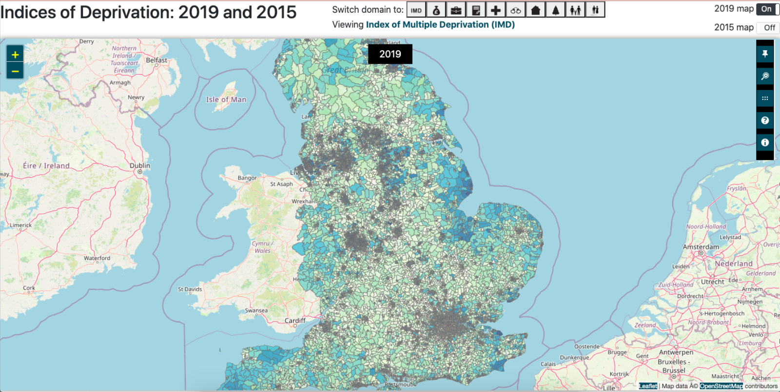
Map view of LSOAs in England 2019

Community Southwark used GOV.UK's England's Indices of Deprivation 2019 map. They zoomed into Southwark and began noting each LSOA's ranking on a spreadsheet.

By looking at the map or searching the postcode checker, and copying data into a spreadsheet, you can manually create a list of LSOAs you are interested in ranked by level of deprivation.

Create lists of the 10%, 15%, 20% and 30% most deprived LSOAs - these percentages are what funders focus on.

Sort by level of deprivation, from the lowest number to the highest.

As a reminder, an LSOA is in the 10% bracket if it has an overall score of 3,284 or lower. 20% goes up to (and includes) 6,568 and 30% up to 9,852.

Example of a simple spreadsheet for recording LSOA name and rank

Community Southwark have reflected that searching maps for LSOAs in this way is not perfect. They found that depending on the size of an area they want to search finding and copying LSOAs takes a while. This is because there is no search functionality in the England map, they had to manually look for them.

It’s also not very accessible for people with some disabilities.

While the data may be available in another format, it isn't as visual as a map. 

“You can see the shape of LSOAs and how weird and wiggly they can be. So it’s not like an abstract concept.” - Alex Wells, Community Southwark.

You can use Google My Maps to create a map that just shows the LSOAs you are focused on, split into different levels of deprivation. This will help you share information with stakeholders and funders in a clear and visual way.

Create a KML file

First you need to download a KML file containing the LSOAs you want to show. A KML file is used by some mapping tools, including My Maps, to create shapes and highlight areas.

You can create separate KML files for each percentage of high deprivation: 10%, 15%, 20% and 30%.

  1. Go to the public list of indices of multiple deprivation and click on ‘Indices of Multiple Deprivation (IMD) 2019’.

  2. On the text column, click the filter icon which is shaped like a funnel.

  3. In the ‘Search attribution filters’ list, tick ‘lsoa11nm’ - this means it will filter by the LSOA name. Clicking on the LSOA in the map will give you the name - it will be the borough or district, plus some numbers and a letter, for example ‘Southwark 015D’.

  4. Search each LSOA you want to add to the KML file. A list will display above the search box as you add them.

  5. Click the download icon below the filter icon and make sure you click ‘Toggle Filters’ to on - this means you will only download your files and not every LSOA in the country!

  6. Download your KML file to your device. It may take a few minutes.

  7. Repeat with the next percentage.

Make your map using Google's My Maps

Now you will add the KML files to Google My Maps to make your map. Google My Maps is a different tool to Google Maps.

  1. Go to Google My Maps - you can login with your Google login if you have one, or as a guest.

  2. Click ‘+Create a new map’.

  3. Starting with 10% highest deprivation, under ‘Untitled layer’, click ‘Import’ and upload your KML file.

  4. Repeat for each KML file. This will add each file's data as a separate layer. This will give you a layer for each LSOAs showing 10%, 15%, 20% and 30% highest deprivation.

You can rename the layers and change the colour and transparency to make it visually clearer.

Once you’ve created your map, you can embed it into your website or share it with stakeholders.

A completed map showing Southwark's most deprived LSOAs

Community Southwark have found mapping LSOA data useful to help advice groups map their users and apply for funding.

For example, for a group helping parents of children with special educational needs, a map can show that 60% of their families are living in areas of high deprivation, judging by their postcode data.

People in the area might know that it’s deprived, but using the common statutory metric can make it clearer for other services and potential funders.

Although the deprivation metric is a sector standard, data cannot tell a story to a potential funder like you can. You still need to talk about the lived experience as you see it ‘on the ground’.

Deprivation data should be used to support the narrative about how people use your services and to open up a conversation about deprivation levels.

Though the data is anonymised, using it alone could give a one-sided impression of an area and fail to show any positive aspects. You cannot judge an area based only on its deprivation ranking.

Community Southwark said that mapping deprivation in this way can sometimes be a ‘hoop jumping’ exercise. Especially for national funders who may not know the area and want to know how organisations are targeting deprivation.

You will need to keep up to date with changes to the deprivation data. England’s data, for example, was last recorded in 2019 and may be renewed by the end of 2023. You may see changes which impact your chances of getting funded or where you target your support.

Further information